
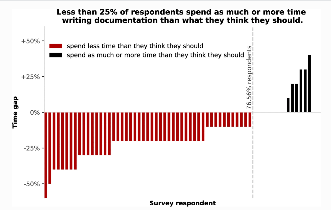
The gap between how much surveyed OSS library developers usually spend on documentation versus they time they think they should spend on documentation. Each vertical bar is a single respondent from a survey of developers at a scientific computing conference. Negative values represent respondents that believe they should spend more time on documentation, codified as “Documentation Guilt.” Figure created from data by Holdgraf and Varoquaux (2017). The Types, Roles, and Practices of Documentation in Data Analytics Open Source Software Libraries


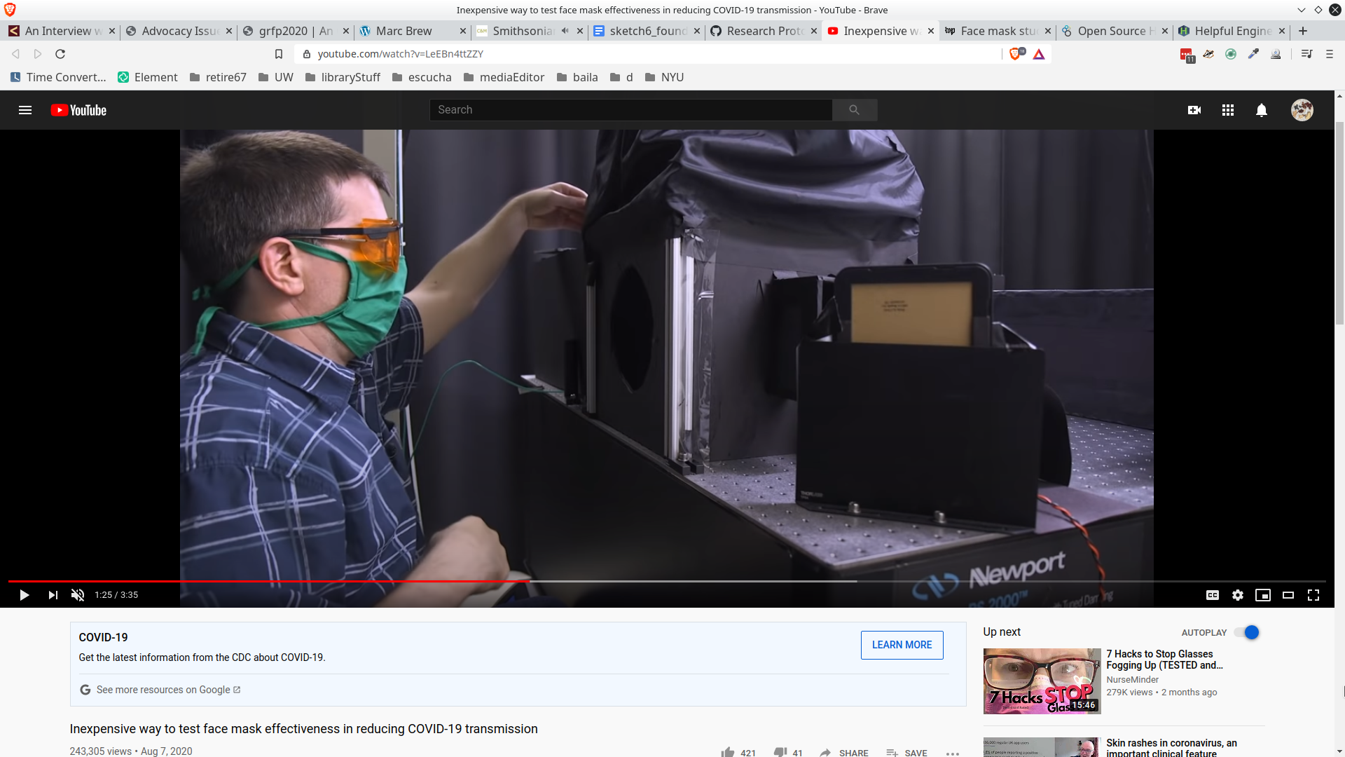
Dr. Martin Fischer, Ph.D., from Duke University, developed a simple, low-cost technique to visualize the effectiveness of different face coverings on droplet emissions during normal wear. Testing several face coverings, the researchers found that the particles can be blocked by some, but not all recommended face coverings. N95s without valves, and surgical, and polypropylene masks worked best. Cotton face coverings provided some coverage. Bandanas and neck fleece didn’t block the droplets very much.
Illuminated through a sheet of laser light, droplets from speaking with no mask are seen on the top right compared with different masks in the three other boxes. (Shawn Rocco/Duke Health)
Wearing a neck gaiter may be worse than no mask at all, researchers find: Duke study finds some cotton cloth masks are about as effective as surgical masks, while thin polyester spandex gaiters may be worse than going maskless.
“Buff performance head and neckwear are not intended to be used as medical-grade face masks or as a replacement for N95 respirators as effective measures to prevent disease, illness, or the spread of viruses,” the statement said.
“All gaiters are not created equal,” Chris Bernat, co-founder of South Carolina-based Vapor Apparel, said. “There’s a segment of this category that’s of a much higher quality that’s engineered to be layered.”

This figure illustrates a dashboard used by companies to keep track of labor disputes/strikes across their supply chains. Dark red means an event is in the present, orange soon, yellow some time away and green no signs of a labor disputes at the moment. The red factory icons also shown in the map symbolize factories closed due to COVID-19.
These are depictions of a systems diagram that the Biospherians created, iterated, and used [in numerous ways] to design and communicate Biosphere 2 [B2]. I'm interested in expanding its readings, and possible Biospherian 'mis-readings,' [their visual systems semiotics were partially derived from Ecosystems Theory 'Emergese' language, but they simultaneoously adapted it into a visual 'slang' of sorts]. Also interested in how this diagram gets translated/materialized into synthetic ecologies within a building/apparatus, and finally, its implications for living within the 'Human Experiment' as component of the diagram.

'Economic System of Biosphere 2' Master Narrative Diagram [my term], from John Allen's book Me and the Biospheres, 2010
 draft 'Economic System of Biosphere 2' Master Narrative Diagram [my term], from B2 unofficial archives at U of A Biosphere 2 facility

John Allen reproducing the Master Narrative Diagram [my term] at a B2 design workshop, from B2 unofficial archives at U of A Biosphere 2 facility

Figure 1. Picture showing the main components of an electroencephalogram (EEG): electrodes attached to a person's head and a display showing brainwaves. Image via Bright Brain Centre (http://www.brightbraincentre.co.uk).

Figure 2. A screenshot of twelve seconds of EEG showing twenty horizontal line graphs: nineteen black brainwaves and a red heart rate (EKG). Image via William O Tatum, 2013, Normal "suspicious" EEG. Neurology 80, Issue 1, Supplement 1, S4–S11.
The black arrows point to evenly-spaced peaks in the first half of the figure; and the red arrows point to choppy patterns in the second half of the figure. Counterintuitively, on EEG, abnormal brainwaves (seizure) can appear 'normal' / evenly spaced, whereas normal brainwaves are choppy and weird!
For more, see my paper (https://doi.org/10.1177/0961463X20908079, ask me for the pdf!)
I was excited for this sketch because PowerPoint presentations and other visual forms of exchange are very common among my interlocutors--sugarcane scientists and industry actors in Brazil. Below are just a few that I'd like to think more about...
First set of images:
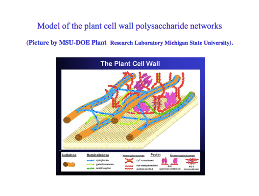
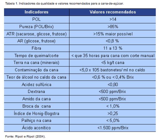

Different sugarcane actors--scientists versus industry consultants versus cultivators--circulate different visual knowledge artifacts that seem to break down sugarcane (conceptually) in different ways. The first image in this set is from a Brazilian scientist's slidedeck during an academic presentation: it's a graphical diagram (borrowed from another lab) of the entangled molecular components of the plant cell wall. The second image is an industry table of various metrics to measure sugarcane productivity and quality. The third image is one page from a catalog of sugarcane varieties, dispalying the specifications and characteristics of a new variety of cane developed in Brazil. These are only examples, but I've seen many versions of these three genres throughout my fieldwork. I'm interested in thinking more about how these different modes of conceptually breaking down sugarcane may relate to different politics of sugar extraction--and thus perhaps how the circulation of visual knowledge artifacts like these contributes to such extraction politics.
Second kind of image:
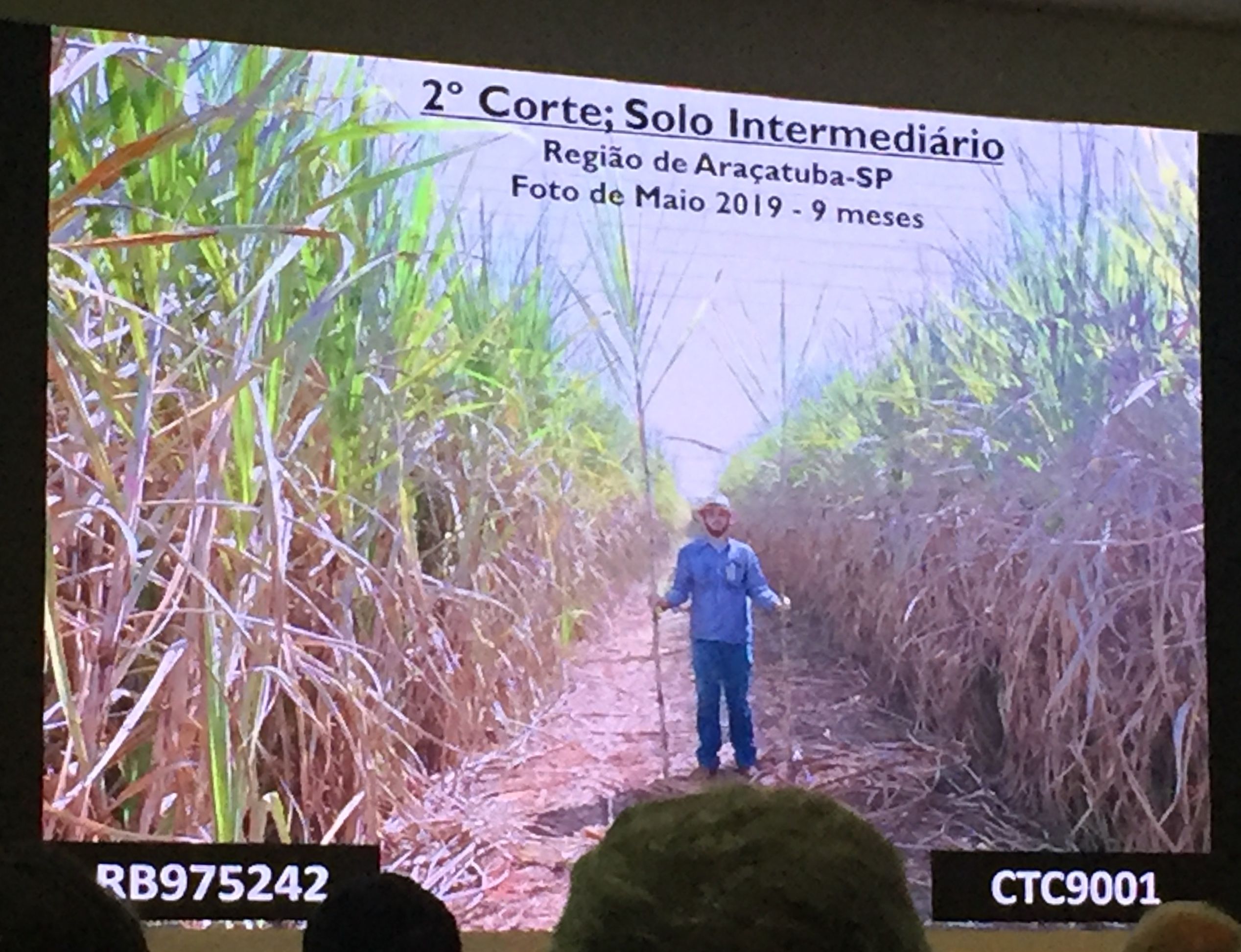
This image is from a sugarcane industry conference, where growers and producers listen to new agricultural developments from mostly sugarcane consulting firms and ag companies. I saw this genre of image countless times--a man holding a stalk or two of sugarcane to compare its height, which is understood to correlate with the specific cane variety's health and productivity. In this image, the cane on the left and right are different varieties grown side-by-side in São Paulo. It seemed that this genre of image constituted reliable visual evidence within a shared realm of understanding among growers; it was not merely to fill slide space. I was struck by the gendered (perhaps phallic) characteristics of this genre of evidence, particularly as I learned that more growth does not always equal higher quality cane (I talk about this more in my 4s presentation). I'd like to think more about this kind of image in relation to different ways of knowing cane, by different kinds of sugarcane actors.

Figure 1. This is a slide from a public research presentation at Stanford University and highlights how "reproducibility" has been a key motivating factor for many open science researchers. This presenter speaks about a shift towards "extensibility".